Haven
Caregiver and Healthcare Support
Caregivers are looking for help and a little more time for themselves. This end-to-end design explores ways to build a support team, ask for help and support mental health.
My Role
UX/UI Designer
Timeline
3 Weeks
Toolkit
Figma
FigJam

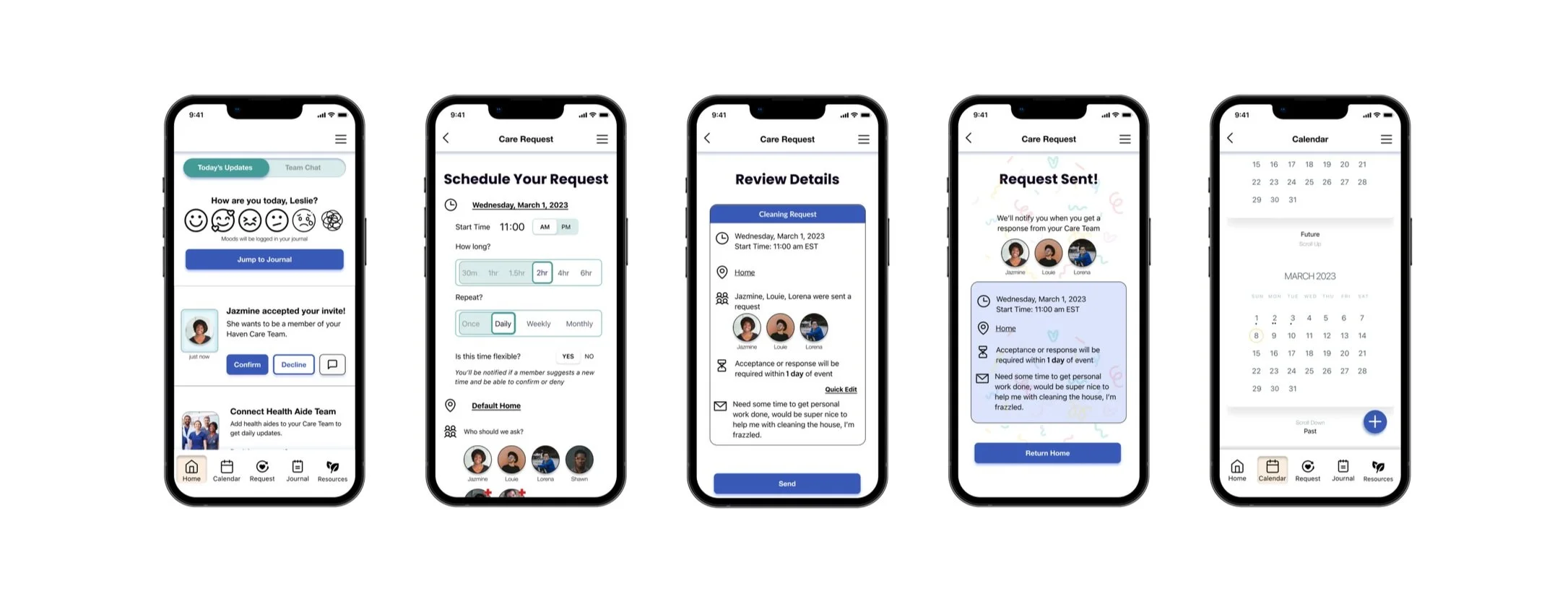
Final Screens
About the Project
A caregiver is a spouse, partner, family member, friend, or neighbor involved in assisting others with activities of daily living and/or medical tasks.
Approximately 43.5 million caregivers have provided unpaid care to an adult or child in the last 12 months. 65% of care recipients are female, with an average age of 70.
Caregivers bear a great deal of responsibility and while most informal caregivers are providers first and foremost because they feel duty-bound by love, they also experience a great deal of burnout. Haven provides an answer to “Who cares for the caregivers?” by providing support to provide them more time for themselves, access to a private journal, and counseling resources that can assist them with mental stressors.
Background
Upwards of 75% of all caregivers are female and may spend as much as 50% more time providing care than males. Males may be sharing in caregiving tasks more than in the past, but females still shoulder the major burden of care.
Caregivers spend 13 cumulative days a month each month on shopping, food preparation, housekeeping, laundry, transportation, and giving medication, 6 cumulative days feeding, dressing, grooming, walking, bathing, and assistance toileting, and 13 hours monthly per month researching care services, information on disease, coordinating physician visits or managing financial matters.
This is an underserved population, and while there are apps on the market that support caregivers in their daily tasks of providing care for another person, none provide a direct form of support to the caregiver and their journey as a care provider.
Scope
One of the larger challenges in developing and designing the app was narrowing the scope of use.
Based on the user interviews it seemed clear that there would be 3 user types to fully configure the app for optimal use, ease of scheduling, and reduction of stress.
The Primary Caregiver
The Secondary Caregiver/CareTeam Member and,
The Health Aide
I created three provisional personas based on initial research and expanded on those personas for the MVP.
All three are potential users and require different user and task flow paths to round out eased communication and information sharing across the CareTeam. For the sake of the MVP the Primary and some of the secondary caregiver profile are the most important personas. The focus of this app is to provide the primary caregiver with help, options, and a safe haven before it is a place to assist them in their requirements to the care recipient (medication, appointment monitoring etc).
User Goals
Affinity mapping gave me alignment on what users felt in their daily tasks as caregivers. There was a repeated mention of a lack of help, mental exhaustion, and a constant expectation to provide care even when they could not.
I aimed to build something to provide streamlined communication and an easier way to request help from those on their team, whether personal or professional. With more support to allow caregivers more physical time, additional features like a journal and counseling resources can assist them with mental stressors.
Interviews
I interviewed 5 caregivers ranging in age from 28-69 who began as caregivers for family members between the ages of 24-64.
To get to know the needs of caregivers and formulate an app that relieved them of as many additional stressors as possible I asked a range of questions to get to know them better while navigating the delicacy of sadness and loss as some of them grieved.
-
What support systems do you have in place, such as family, friends, or professional resources, if any?
Do you or have you ever received additional support like health/nurse aide services? Do/did you receive this through an insurance policy or Medicaid?
What type of resources would you like to have available to support the well-being of your loved one?
Are there days of rest for you? Who steps in to help at this time? How do you spend them?
Voice Princibles
Writing for UX is a key part of any app or website. Primary caregivers expand across extreme age ranges, though they tend to be older women in their 50’s and up, while CareTeam and HealthTeam members can skew much younger. Additionally, as an app that deals with sensitive healthcare information, speaks to an often stressed or overwhelmed person and needs to be aware of neutral, disability-inclusive language.
Voice Principles for Haven aim to be
Empowering
Empathetic
Clear
Empowering language encourages the caregiver to manage their responsibilities and to find some sense of self. Where possible the app uses the Caregiver’s first name to help them feel recognized.
Empathetic language is kind and calming so Haven remains a place of rest and recuperation, a place they can rely on for support.
Clear language clarifies steps, instructions and information such as resources to avoid confusion and again, be a place where the user does not encounter frustration.
Mind Mapping
The potential of this app is expansive. There are so many avenues in which caregivers need help and a specific area of focus needed to be chosen. In order to gather my thoughts about what those areas of potential were and which features were most critical in being captured in the MVP, I created a mind map to brain dump all potential features and concerns.
After creating this I was able to direct my focus on the things that specifically supported the caregiver and were able to be a decompression service and the items that were most critical to serve the user at initial launch so that it was fully interactive and solved a problem.
User Scenarios to Wireframing
After establishing the goals of the user I create user scenarios to better understand how the user will interact with the app through the initial sign-up flow and what might be the driver to the user to make them sign up.
The sign-up flow gathers preliminary information about the care recipient and the primary caregiver (or whoever is signing up). Due to the strain, the Care member may already be under, I want the sign-up flow to keep the user engaged while gathering information then, once an account is created further information can be added and updated as push/setting requests inside the app.
At this stage, I sketch out initial screens, build out a logo, login flow screens and move to quickly build mid-fidelity wireframes.
My branding and UI kit features blue as a primary color and soft warm orange as an accent color and a seafoam green. These colors are gentle and calming, related to calming feelings. The orange is not loud, simply calls attention. This is particularly important because as I build out I am considerate of older users who may have impaired fine motor function, impaired or reduced vision, or simply feel less tech-savvy then they’d like to be. For these reasons, I make some elements larger and plan to make them have a heavier stroke to indicate they’ve been interacted with when prototyping.
High Fidelity, Testing and Iteration
There were 5 people interviewed for usability testing.
2 of them were caregivers and the remaining 3 ranged in age to get a better understanding of the user base and their experiences.
-
All testers felt that the login setup was simple nor was it too long. They easily interacted with all the selections and drop-downs available.
Users didn’t stumble or miss key points at any time in the login flow
Users didn’t observe the completion bar at the bottom of the sign-up screens
Users felt the overall design was pleasant, soft, and/or mellow.
Users sometimes struggled to interact with the drag on the scheduling page, which may be due to testing on laptops not mobile
Users felt the language used was informative and gentle
Users felt interactions and clicks were clear and obvious when selected
Younger users often interacted with “Calendar” not “Request” when asked to schedule an event
After considering the user’s experience during testing, I made some rapid iterations to clarify some actions and ease use.
The drag function is updated to allow users to also click/jump directly to the selection they’ve chosen
A button was added beneath the mood tracker prompt to allow users to log mood and jump directly to the journal
Text and language were revamped across the app to maintain familiarity and empathy
An add event button was added to the calendar for those who may choose to schedule from a different screen starting point
What I Learned
This case had such a wide range of possibilities in where to take the usefulness of this app and how to change the lives of caregivers it was a stumbling block in choosing its initial direction. With so much opportunity here there’s a lot of space to expand. The caregiver population is a large population that is greatly overtaxed and underserved so it’s a great user base to tap into for further research about their wants. With a rise in self-care content, they are a great market to serve. I would carefully explore this with sensitivity to disability communities, the elderly, and healthcare guidelines to ensure privacy, safety, and respect are paramount to the haven app.
What’s Next?
Do UX research for the secondary personas
Build Secondary persona flow
Complete User/Task Panels for secondary personas
Build out user communications/messaging features
Implement business goals by adding features users can sign up for ie delivery, transport services, counseling, groups and financial services
Add medication tracking and care recipient features
View prototype, click to expand


