Thicc Burger
Mobile and Web Ordering
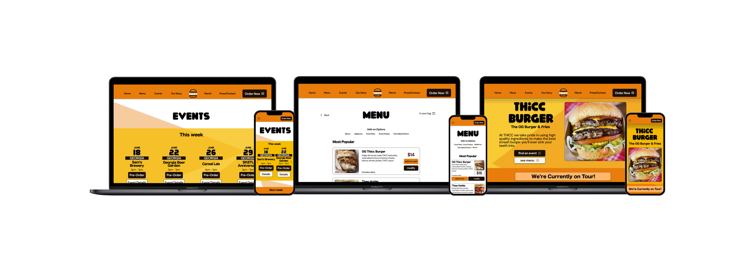
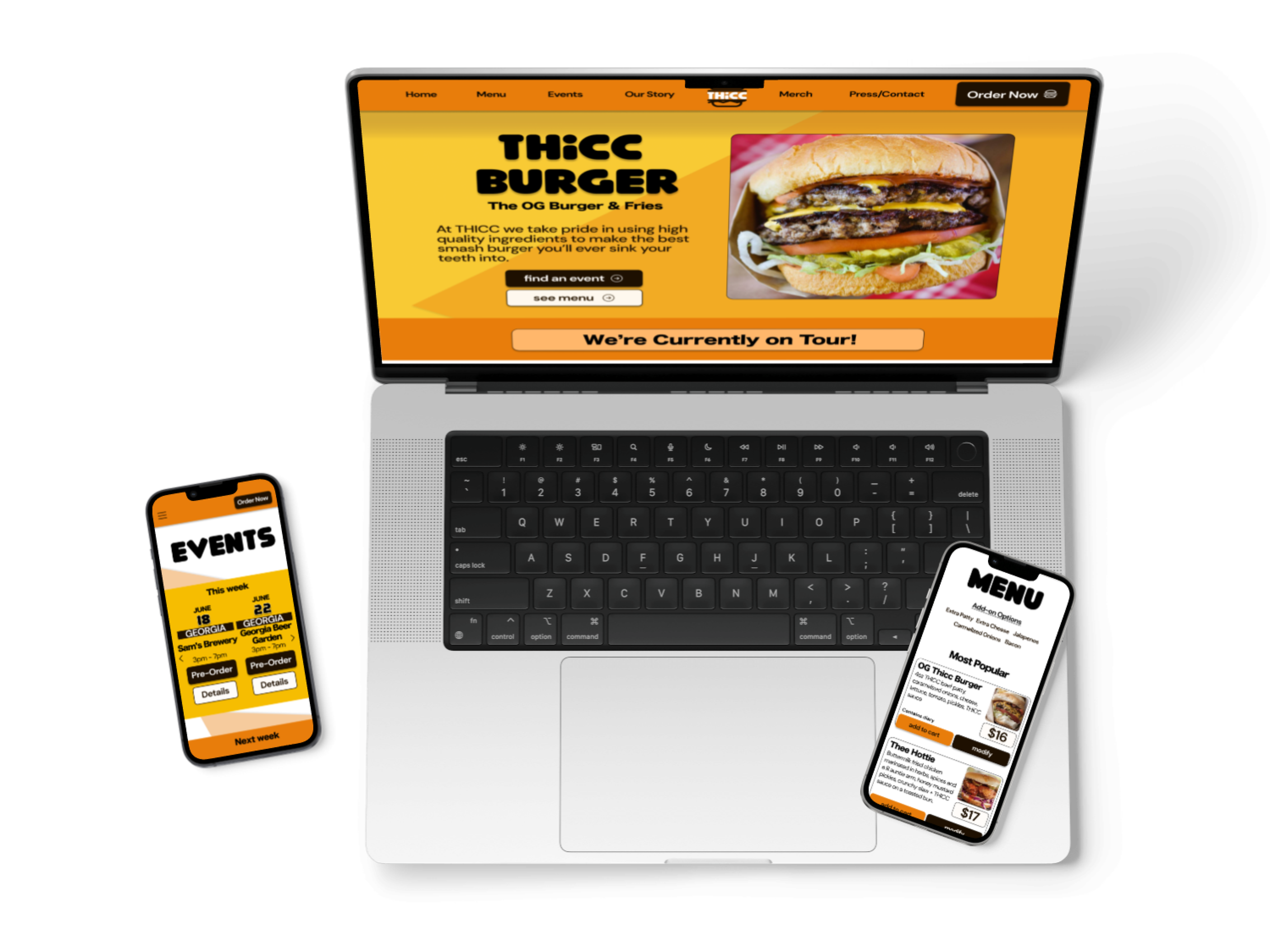
These days great food doesn’t just come from brick-and-mortar shops. In this responsive design, I help a busy burger pop-up’s very loyal and dedicated fans find these great burgers at various locations.
My Role
UX/UI Designer
Timeline
3 Weeks
Tools Used
Figma
Figjam

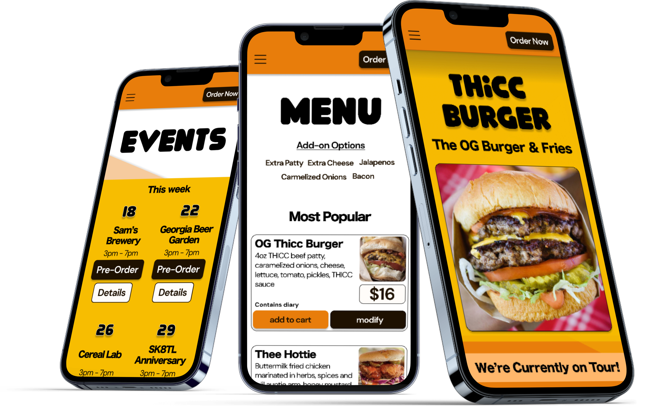
Final Screens
About the Project
Thicc Burger is a traditional burger joint serving the public by less than traditional means. With no permanent physical location, they host pop-up events dominated by pre-order sales from their base in ATL but they often get on the road and tour the country.
When I was first approached by the owner, who runs the operation solo, they were looking for help in turning their website into something beautiful and functional to better generate and retain business.
Without a brick-and-mortar location, Thicc Burger
relies on fliers and social promotions to notify potential customers of events as they move locations for each potential pop-up.
Encourages customers to pre-order in order for Thicc to plan, purchase and prep the amount of product needed per pop-up (with extras for walk-ups!)
Thicc needs a way for customers to find them, anywhere, any time. Okay, maybe only when they are having an event.
Problem
Like most small businesses, Thicc Burger has big dreams. A website redesign will keep the current system working as Thicc builds toward a storefront. As the business grows and changes the site and its brand will need to expand with it.
Create a website that exists as a source of cohesive truth with current information with events beyond a one-week window to give users more access to plan, order, and attend events. This also allows the business owner to plan cost-effectively and in advance.
Streamline the pre-ordering process so the customer knows when and where to pick up their delicious burgers.
Make event information bold and easy to navigate.
Maintain the brand’s existing sense of fun and whimsy, it doesn’t take itself too seriously.
It’s important to understand the major pain points users experience in using the THICC Burger current website on both desktop and mobile to see what elements create user frustration and/or low event attendance.
Increase event attendance rates by 35% by increasing event awareness with a true source of information being a website, rather than a social flyer
Increase business revenue by including merch sales and bookings for catering and parties
Drive new customers and increase repeat customers by 30% by implementing a newsletter or text sign up
Design & Business Goals
There is a burger revival on the rise and Thicc Burgers is a contender among the fray. In the target demo, fast food (mass production brands like McDonald’s and Burger King) purchases are down nearly 20% as Millenials and Gen Z consumers prefer the healthier options of "fast-casual" that offer more handmade, locally sourced items.
Many of the competitors’ researched originated as single-location food trucks or pop-ups and have grown to generate revenue of up to $100 million.
The five brands in the research sprint all have a number of things in common
Market Research
-
The five brands in the research sprint all have a number of things in common
Digital and pictured menus
Pickup and delivery options
Heavily leaning local sourcing and freshness
Merchandise often available
All similar target demo between 18-35
Interview participants range in age across the target demo of our successful market research demographic to ensure we’re reaching our market and those who are interested in what Thicc and its competitors have to offer - locally sourced, handmade, well-crafted food that is thoughtful and imaginative. Importantly, this site requires navigating to find a moving target, while you’re hungry. So there is special consideration to how users are able to find the location of this pop-up shop.
What sends you to a specific restaurant page — a recommendation from a friend, social media posts, or google searches?
Tell me what was the most recent reason you visited a restaurant's website? (intent on going, needing to read the menu, planning to order directly)
speak to any frustrations you’ve come across while interacting with a restaurant site
Do you find yourself willing to review restaurants posted testimonials or do you rely on third-party review sites like yelp or google reviews?
In the midst of interviewing the original Thicc website crashed and became largely unusable. I had intended for users to explore the site in interviews to give me feedback based on the live site. This had to change in real-time for some interviews and I pivoted my line of questioning. These questions included asking about their merchandise experiences and online ordering.
From the interviews, I break down responses in an affinity map and discover two main types of users. Experience seekers and Value/Need Seekers. I build two personas around these types.
5 Interview subjects
Conducted via remote conference
Ages 21-34
Frequents fast casual
Interviews
Establishing these personas and identifying other user needs taken from the interviews have identified what our user needs most as they arrive at the site.
Users are looking for what food items are available to them here, information about allergens/dietary restrictions, and they are looking for some kind of social proof.
All users care about these things the most.
Affinity Maps & Personas
It’s finally time to explore how to solve our user’s problems. I set up some ‘how might we’s’ based on the personas, money-conscious, entertainment-conscious, diet-conscious, and lastly, finding the event. With some thoughtful ideas to explore, I start sketching what those might look and feel like.
How Might We…?
As a responsive design, I wanted to design for two screen sizes. Having sketched mobile-first, I wanted to translate this for desktop and mobile. I focused my time on designing for desktop. However, as the marketing is done on social media, it is most likely that users will use mobile to navigate the site, so it is still a priority for me to make functional mobile screens.
User Scenarios
Because of the nature of this pop-up-style venue, pre-ordering is preferred, though walk-up clients are not turned away unless supplies run out. Streamlining the order process is a priority.
Click task flow image to see more
Lofi & Mid-Fidelity for Desktop
My first ideas are to give the user a landing page upon arrival to the website. The landing page gives the user the option to immediately skip to the menu or find an event. A third option is to visit “Mouthfeel” which is the parent brand to Thicc Burger and links to other food businesses, whose pages will be built in next steps. It’s also a priority to make the menu clear and legible. Commonly menus are written are center-aligned lists, however, this does not give the user as much ability to see all the information they need at a glance.
Written as cards the user can more easily identify the pattern of each card and see an image, which solves another user concern - images are important for desire and enticement.
After sketching in mobile I designed mid-fidelity frames to demonstrate responsive design in the second most common screen size for visits to the Client site.
Thicc Burger has developed its own sense of very fun branding. They have nearly 6k followers on Instagram, have been featured in magazines, and served festivals — even political events. Pivoting away from its branding is not something that works well at this stage for the still-growing recognition but also because it’s already wonderfully chosen with warm, active, fun colors that stand up well against its brand ideals and fun titles.
The only changes I make are some simple typography changes for clarity and modernity and I give them a simple logomark.
Tweaking Great Branding
High Fidelity & Usability Testing
My challenge in prototype testing was in making sure the task flow worked seamlessly for readability and expedient ordering as my initial interviews showed that unless the user was doing research on an event or location they were most likely to first want to view the menu before anything else.
Version 1 usability testing
Version 1 usability testing
Usability Feedback & Iterations
100% success rate of task flow
100% of users confirmed ease of navigation and it worked as expected
75% of testers desired more confirmed feedback as they clicked through the screens
50% of testers wanted larger images on menu items
I implemented the user feedback and revisited ideation and sketching for the home page because the design felt flat and railed against typical design patterns with the button spacing. I wanted some visual interest and delight, but also for the sight to feel more modern and less like it just crawled from the early 90s internet. I let go of the playful sign that felt like it fit the Clients’ easy nature but did not make for a dynamic website that fit typical design patterns.
-
4 people were interviewed for usability testing, they were asked to
Navigate to the home page from the landing page
Select an event to pre-order from outside of the current week
Add a cheeseburger (BIG BOI) with bacon, and
A large black hoodie to their cart
Checkout
Explore the website for 1-2 minutes and provide feedback
-
I revisited the home screen and gave things a shuffle. Landing on a far more pleasing home page design that amplifies that really delicious burger, displays the current tour status prominently above the fold, and two buttons that help direct the user to what our users said they need the most.
-
For the menu screen, I removed the add-on pricing and prominent orange color because this misled users to believe they were buttons. I instead incorporated an overlay when ‘modify’ is selected. I also enlarged the images a bit and added more interactions for user feedback.
What Did I Learn?
Sometimes your process is different enough from the average competitor's that you can't mimic them in a way that is relevant to your design. It was important to divest from the way larger brands conduct online ordering flows in some ways because events are a permanent fixture.
This changing location provided a bit of a challenge to work with as it cannot follow the typical procedures of our competitors' ordering and information style.
Always be willing to let go of your designs and redesign. I was struggling to change the homepage to make it more visually pleasing and knew I was breaking design rules but I was too attached to my 'sign'. Once I removed it, the design pattern opened up.
I was deceived by the 'simplicity' of a restaurant site. It seems fairly straightforward but this was a marriage of an event, food/ordering, and shopping site which added to its layers.
During build, it's important to keep business goals in mind because while several pages created have little value to the average ordering customer they have large revenue potential for the Client, meeting the Clients needs for business and their customer's needs in experience are both important.
What’s Next?
Order Flow The entire ordering flow was not built out because the Client intends to send to a 3rd party app to complete orders. Next steps are to build out ordering or connect the 3rd party flow.
Iterate on Filters/Search Explore if this is beneficial to users to search by location and relevant to the number of events the Client intends to hold.
Introduce Gallery Page Add a gallery page of past events, locations, and professional images once this is completed on the Client side
This project was built for Thicc Burger via DesignLab Academy


